Week 20
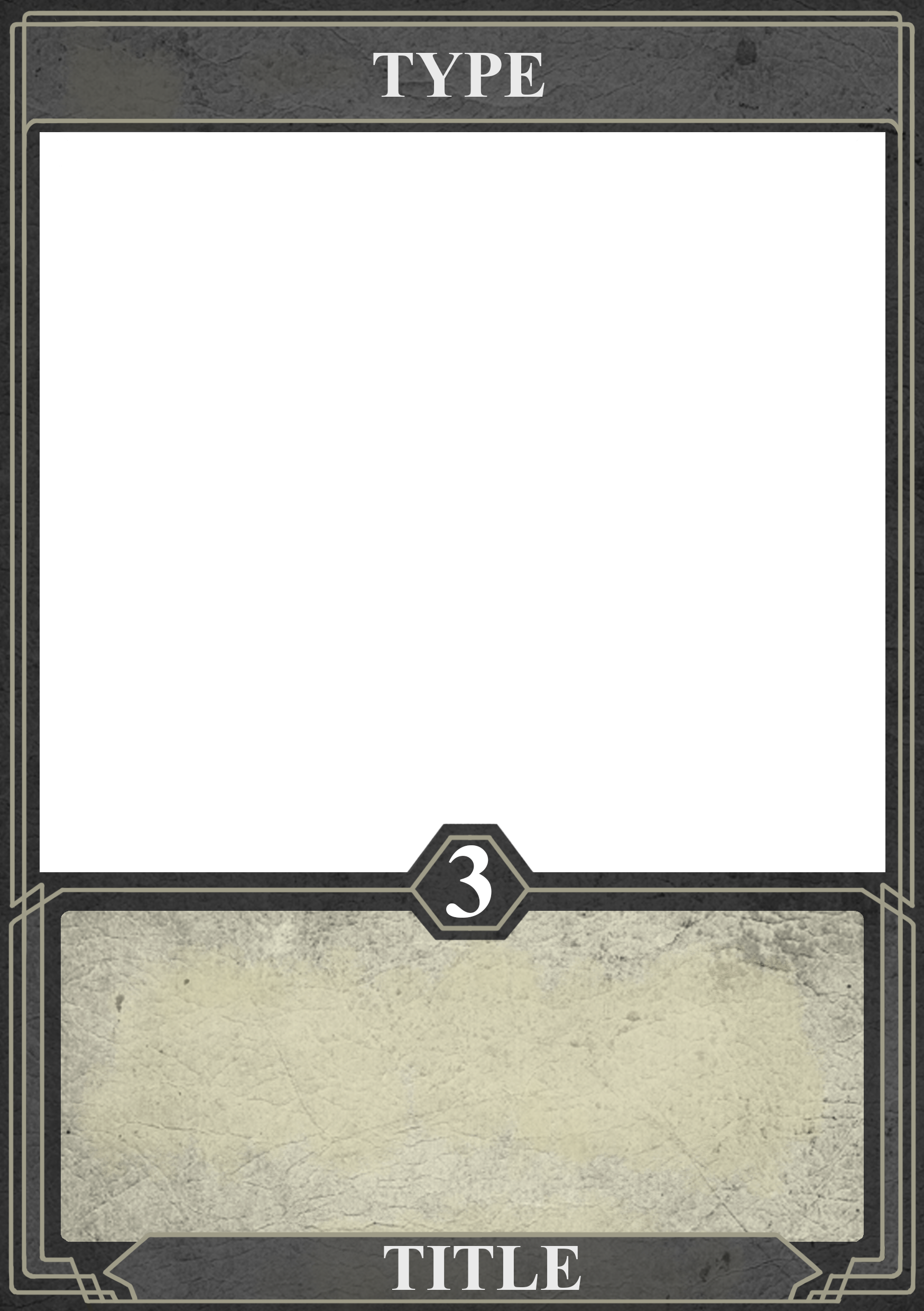
I started this week with Redesigning our card frames in order for them to fit the theme of our game better. The new frames have more angular elements that will tie in better with our logo and our GUI design. We tried to give all the different types of cards their own color in order to create a more visually diverse and clear representation for them. But we quickly noticed that having to many different colors made the game feel a bit to cluttered and decided to only give different colors to the Stealth, Gadget and Null cards, because they possesses special functions in the game that we wanted to highlight.

When I was done with the cards I continued working on the three sketches that I started on last week as well as did two more. In order to work more efficient in the limited time that I had available, I used a method that had been suggested to me by our Graphics teacher Lina. The method was to work on the part of all the illustrations that looked worst, or most unfinished for a set time period, and then moving on to the second worst part after that, and so on. This allowed me to produce out a set of decent looking illustrations in a relatively short time period.


When I was done with the five illustrations that was the last of my initial work load, I took up working on another three illustrations that we wanted to have in our game, such as the; You Win and You Lose card.
